7 Landscaping Website Design Ideas To Get More Leads
Do you want more clients for your landscaping business? Maybe your landscaping website could use an upgrade. Here are 7 landscaping website design ideas to help your site get more leads. Our mission at Supersonic Sites is to help landscapers worldwide reach more clients. As we surveyed the "landscape" (pun intended) of landscaping websites, we found that many were outdated and not optimized for client acquisition. We decided to condense our knowledge of what makes the difference between a good and a great landscaping website into this article.
These tips are easy to follow and will make a big difference if you have a good web designer on your team who can implement them.
Ready to make your website awesome? Let’s dive in!
Hire a Professional Specialized in Landscaping Web Design

The first landscaping website design idea is...hire a professional or have one on your team. Wix and other big company are trying to pretend that's it easy to make a website and in a way, it is...but the devil is in the detail. What separates an okay website and a great landscaping website are those hundreds of little details.
Unless you are bootstrapping, avoid the rabbit hole and the headache of building your own landscaping website. Invest in your digital storefront by hiring a professional who understands your market.
Can a generalist do the job? Sure. But as we discovered in us becoming experts in landscaping web design, the little details matter the most.
Curious to know how much a landscaping website cost? Read our The Complete Guide To Landscaping Website Costs for more details.
If you are bootstrapping and can't afford a professional, the ideas in this article might seem advanced due to the technical skills required. However, you still need a website, right? If you need a simple website quickly that you can DIY, consider using CARRD. It’s cost-effective and easy to use for creating a simple "brochure" website. For instance, the website clipityardcare.com was made using CARRD in just a few hours. It’s a great example of what you can achieve on a tight budget.
Place Your Offer and Lead Capture Above the Fold

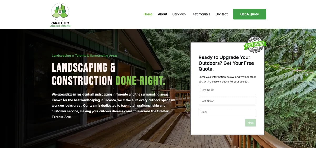
The next landscaping website design idea, and it's a very important one, is to place your offer and lead capture above the fold. This means putting them at the top of your webpage where visitors can see them right away without scrolling down.
What is an Effective Landscaping Website Offer?
An offer is something you give to your visitors to encourage them to contact you. If you can, try to go beyond the "get a free quote" offer, it's better than nothing but it isn't that compelling. Think about special deals like "First lawn care visit free" or "Get 10% off your first service.", etc. These offers grab attention and make people want to take action.
Why "Above the Fold" Matters for Landscaping Websites
Putting your offer and lead capture above the fold is crucial because most people never make it to the bottom of the page. In fact, barely 25% of visitors scroll down past the first few screens. By placing important information at the top, you ensure that almost everyone who visits your site sees it.
This simple change can significantly increase your website's lead generation. When people see a great offer right away, they are more likely to contact you. This helps you get more clients and grow your business.
Design Your Landscaping Website With Advertising in Mind
The next landscaping website design idea is about thinking about your website from the perspective of advertising. Most web designers have never run ads and don’t understand how their designs impact lead generation. Yikes! This means they might create a pretty site, but it won't help you get more clients.
Gary Halbert, a legendary copywriter, taught an invaluable lesson:
If you were on a desert island and had to send one last letter, you had to make sure the person who received it would open it and then take action to save you...how would you package that message and what would you write?
You are not on a desert island, but imagine that you just paid $5 for someone to see your website. What would you include to make the most of that visit? Imagine you have only one chance to capture your visitor's attention and get them to act.
The design and message should be clear, urgent, and emotionally engaging.
Create an Attention-Grabbing Headline
Start with a headline that grabs attention. It should be clear, direct, and make visitors want to learn more. Think of it as the first thing people see – make it count!
Develop an Irresistible Offer
Next, give them an offer they can’t refuse. It should be more than "get a free quote." Try something like "First lawn care visit free" or "Get 10% off your first service." A compelling offer encourages people to take action.
Provide a Clear Next Step for Your Visitors
Finally, tell them exactly what to do next. Use a strong call to action (CTA) like "Call Now," "Claim This Offer" or "Book an Appointment." Make sure it’s easy to find and understand.
Showcase Your Landscaping Projects to Boost Conversions and SEO

Advanced landscaper website design tip:
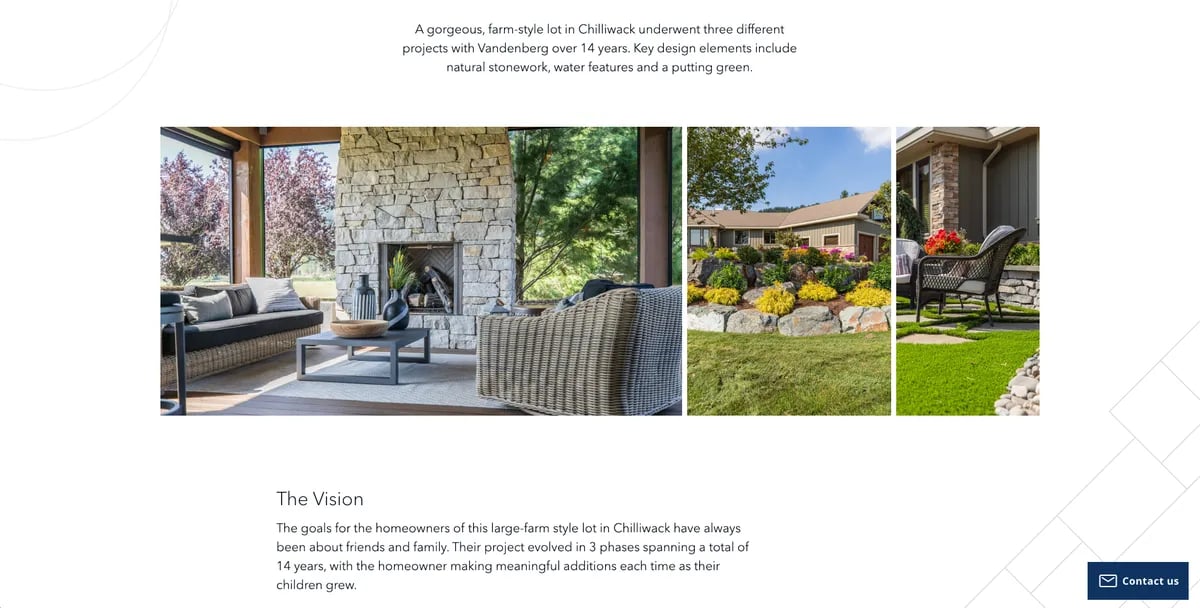
One of the best ways to make your landscaping website stand out is by showcasing your masterpieces. Show off your best work! Not only does this show potential clients that you do beautiful work, but it also helps with your SEO ranking.
Portfolio pages are perfect for this. They let you display your projects in detail with photos and descriptions. This makes your website look professional and helps visitors see what you can do.
But that's not all. Portfolio pages also add more "volume" to your website. The more quality pages you have, the better your site can rank on Google. This means more people will find you when they search for landscaping services.
For example, when you create a portfolio page, you can link it to your services and location pages. This helps boost your main pages in search results. The more you connect these pages, the better your site will rank.
By adding detailed portfolio pages, you not only impress your visitors but also improve your SEO. This is a win-win for your business. Make sure to keep your portfolio updated with your latest and greatest projects to keep attracting new clients.
Include a Thank You Page with a Scheduler

When someone fills out a form on your website, don't just lead them to a page with "Thank you." on it. Create a special Thank You page with a scheduler! This makes it easy for them to book a visit or a phone call with you.
If you use tools like Jobber or Calendly, you can set up a schedule that shows when you’re available. This means you don’t have to be free all the time. You can decide the best times for appointments, making it easy for both you and your clients.
Benefits of a Scheduler on the Thank You Page for Landscaping Websites
Using a scheduler has many benefits:
- Saves Time: No more back-and-forth emails to set up a meeting.
- Professional: It makes your business look more organized and professional.
- Better Lead Conversion: When clients can easily book a time, they are more likely to follow through. This turns more leads into actual sales.
Introduce an "Unlockable"
Here's a cool idea: Offer an "unlockable" bonus for booking now. For example, if they schedule a visit or call right after filling out the form, they could get a special discount or a free lawn care tip guide. This gives them an extra reason to act quickly.
Optimize Your Landscaping Website for Fast Loading Speeds

One key landscaper website design tip is to make sure your site loads quickly. Why? Because a slow website can make you lose potential clients. Studies show that a site that loads in 1 second has a much higher conversion rate than one that takes 5 seconds. In fact, websites that load in 1 second can get up to 5 times more leads than slower sites.
Why Fast Loading Speeds Matter
Most people won’t wait around for a slow website. If your site takes too long to load, visitors might leave before it even finishes. This means lost opportunities and fewer clients. By having a fast-loading website, you keep visitors engaged and increase the chance they will contact you for your services.
How to Speed Up Your Landscaping Website
Here are some simple ways to make your website faster:
- Optimize Images: Make sure your images are not too big. Compress them so they load faster.
- Minimize Code: Clean up your website's code. Remove any unnecessary elements to help it load quicker.
- Use a Good Hosting Service: A reliable hosting service can make a big difference in your site’s speed. Don't cheap out on hosting, it's like the foundation of your house.
Improving your site speed is crucial for getting more leads and growing your business. A fast website shows that you are professional and ready to serve your clients quickly and efficiently.
Pull Testimonials Directly from Google My Business

One of the best ways to show potential clients that you do great work is by using testimonials. Testimonials are comments from your happy customers telling others how awesome your services are. But not all testimonials are the same. To make sure they look real and authentic, it's a good idea to pull them directly from Google My Business.
Why Google My Business Testimonials?
Google My Business is a trusted place where people leave reviews. When visitors see real testimonials from Google, they know they can trust them. It’s like getting a thumbs up from a friend!
How to Showcase Testimonials
A good web designer can help you find a way to show these testimonials on your website. They might use special tools like plugins or widgets to automatically pull the latest reviews from your Google My Business page. One of the popular one is Elfsight Google Review Widget.
Benefits of Showing Testimonials
Here’s why showcasing these testimonials is so powerful:
- Build Trust: When people see that others are happy with your work, they are more likely to trust you.
- Showcase Real Feedback: Authentic testimonials show potential clients what they can expect.
- Boost Your Credibility: Having real reviews makes your business look more professional and reliable.
Keep It Updated
Not a landscaper web design tip but important none the less, have a strategy to gather as many testimonials as possible. For example, you can have a QR code on a card for client's to scan to leave you a review before you leave the job.
By pulling testimonials directly from Google My Business, you ensure that your reviews are genuine and up-to-date. This simple step can make a big difference in convincing new clients to choose your landscaping services.
Conclusion
A well-designed website is key to attracting more clients for your landscaping business. By following these seven landscaping website design ideas, you'll create a site that not only looks great but also works hard to bring in leads. From placing your offer and lead capture above the fold to showcasing your best work and pulling testimonials directly from Google, each step helps you stand out and convert visitors into clients.
To your continued success.
Cheers!


.jpg)